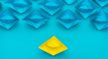
Introduction
What makes the difference between a great website and a mediocre one? As we have mentioned in previous posts, “It takes about 50 milliseconds (that’s 0.05 seconds) for users to form an opinion about your website that determines whether they like your site or not, whether they’ll stay or leave.”
Aside from having a very limited amount of time to create a great impression, you are also competing with millions of websites, so it is critical to ensure that your website stands out. For every search query, there is a multitude of search results specific to that person’s needs.
Your website is the one aspect of your business that you do have control over.
Layout and design
Considering that customers are making a judgement about your site in an incredibly short space of time, the first aspect you need to look at is your design.
You need to ensure that you are keeping up with the latest trends while remaining loyal to your brand. We recently posted an article on the latest trends, so we won’t rehash those. Two points worth reiterating is that research showed that 94% of negative website feedback was design related and 38% of people will stop engaging with a website if the content or layout is unattractive
A website that looks outdated will not hold anyone’s attention and will negatively contribute to your company’s credibility. If your images and fonts are from 10 years ago, the perception will be that your products and services are more than likely also outdated.
But let’s look at some of the basics, especially when it comes to negative feedback. For example, the research showed that users don’t enjoy websites that are overly complex and difficult to navigate.
When it comes to your website design, many elements can put a prospective customer off. And those are things like boring designs, bad colour choices, too much text, small print, and too many pop-up ads and search features that are ineffective.
Your landing page
Creating a positive impression is critical; now that you have attracted a customer’s attention, you need to keep it. Your homepage creates the first impression and will influence how your site is perceived and is crucial as to whether or not your customer wants to know more about you.
It needs to contain just the right amount of information to create interest. Your homepage needs to reflect the most important and useful information. When anyone lands on a homepage, they want to get a quick idea of who you are and what your offer.
Your landing page needs to contain a logical space where you want to focus your potential customer, it can be a text or an image, but it should be something that immediately introduces your business.
Colour
Colour is often underestimated but can be one of your most impactful tools. Choosing the right colours isn’t just about aesthetics. The right colour choice captures people’s attention and communicates meaning, and can also impact how customers interact with your website.
Your colour choice also plays a vital role in guiding your customers through your site’s content efficiently and effectively. Colour can positively contribute to how you build your content hierarchy in terms of highlighting key information, and driving conversions and calls to action.
A great example of how colour can impact conversion rates was reflected in an A/B test performed by Hubspot, where they specifically looked at the impact of colour and the relationship to conversions. They created two identical pages with different coloured call-to-action buttons – one was green, and the other was red. The experiment’s results after 2 000 visits showed that the green button attracted 21% more clicks than the red button.
Great colour choices take planning and, when done correctly, can impact and influence how your customers interpret what they see as much as layout and copywriting do. Colour can make your website more memorable and enjoyable and stand out in an overly crowded market; colour is the one tool that will do just that!
As we all know, colour can evoke emotions, and we often subconsciously make decisions or judgements based on colour choices which is why colour is so important for your website.
Images
Customers spend on average 5.94 seconds looking at a website’s main image. If you compare that to the amount of time it takes a customer to form an opinion about your site, you can see that they are an important aspect.
Images are the ideal way to add depth and make things much more interesting. Just make sure that your images communicate your message effectively and are in line with your brand. You want to choose relevant images that don’t distract from your website’s objective.
And sometimes, well, most times, less is more. Rather ensure you’re a few high-quality images than a carousel or slider as it can be distracting and your customer is, in all probability, only going to focus on the first image they see.
Website navigation
This is another element that is often underestimated. It is like your website’s map; if it isn’t clear enough, your customer won’t know where to go. Websites that are easy to navigate provide your customer with a fast and effective way to easily access the content they are looking for.
It is always worth remembering that your website should be designed with the customer in mind! Dropdown menus with lots of nested content are a navigational nightmare. Everyone prefers sites whose menu structure is clear, allowing them to move between pages easily. Your website may look great, but if it is difficult to navigate, your customers will look elsewhere.
Eye-tracking studies that analysed website users’ behavior found that people tend to look at websites in the same that they would read a book. They concluded that “Eyetracking research shows that people scan webpages and phone screens in various patterns, one of them being the shape of the letter F and this occurs as follows:
- Users first read in a horizontal movement, usually across the upper part of the content area. This initial element forms the F’s top bar.
- Next, users move down the page a bit and then read across in a second horizontal movement that typically covers a shorter area than the previous movement. This additional element forms the F’s lower bar.
- Finally, users scan the content’s left side in a vertical movement. Sometimes this is a slow and systematic scan that appears as a solid stripe on an eyetracking heatmap. Other times users move faster, creating a spottier heatmap. This last element forms the F’s stem.
- The implications of this pattern are:
- First lines of text on a page receive more gazes than subsequent lines of text on the same page.
- First few words on the left of each line of text receive more fixations than subsequent words on the same line.”
Content
We seem to be continually referring to content, but it is one of the most important aspects of your site. People visit websites in order to view or access their content.
Content is everything from headlines and text to images and videos, and it is key to ensure that all your content is integrated seamlessly into your website’s design. And above all, your content needs to effectively portray your business in a positive light.
In an ideal world, your customer lands on your homepage but dependent on their search query, they may land on another one of your webpages. If that page is content-heavy and boring and looks like someone’s thesis, you will lose your customer’s interest.
According to Hubspot, If given 15 minutes to consume content, two-thirds of people would rather read something beautifully designed than something plain. We all like to consume content that is exciting and easy to read.
If blog posts or articles form part of your content, you need to ensure that you post original content regularly and consistently.
Don't irritate your customer
It may sound obvious, but so many websites irritate their potential customers without realising it. And an irritated customer is unlikely to return. Away from some of the factors we have mentioned above like navigation, there are additional key factors that also cause frustration:
- Slow response: Any site with pages that take too long to download will see their customers leaving in a flash. If you aren’t sure of your website’s response times, you can try this free tool from Google to check the speed of your website’s pages so that you can fix any potential issues.
- Your content should always be in a readable format; in other words, no one wants to waste time zooming in and out to read what is on your website. Your content needs to be able to adjust according to your customer’s device screen size and resolution.
- Your website must be mobile responsive; once again, it should adjust according to their mobile device. To put it in perspective, over 83% of users expect a seamless browsing and navigation experience on their mobile. Unfortunately, websites that aren’t mobile responsive are not providing a quality user experience and are poorly designed.
Conclusion
When it comes to websites, first impression count, every time! Design your website to reflect your brand, and most importantly, design your website with your customer in mind.
After all your objective is to grow your revenue and you therefore want to make every touchpoint within your business a quality and enjoyable experience for your customer.